TIL: Plotting Neo4j Results with Matplotlib
- December 13, 2023

It turns out that it is really simple to convert a Neo4j Result into a Pandas DataFrame.
Earlier this week, I had to produce some quick throw-away reports for GraphAcademy enrolments for the year. I already had VSCode open, so rather than use my NeoDash dashboards, I thought I’d just put together a quick Jupyter Notebook.
I have been playing around with Matplotlib a lot recently, and in doing so discovered the DataFrame.plot() method.
You can comine this with the Result transformers to convert the Neo4j Result into a Pandas DataFrame, and then plot the data with just two lines of additional code.
A worked example
Have you ever wondered if movies are getting worse? Let’s use the data in the Movie Recommendations Sandbox to find out.
First, let’s connect to a Neo4j instance.
import os
from neo4j import GraphDatabase, Result

driver = GraphDatabase.driver(
    os.getenv('NEO4J_URI'),
    auth=(os.getenv('NEO4J_USERNAME'), os.getenv('NEO4J_PASSWORD'))
)

driver.verify_connectivity()
At this point, I would usually run the following statement to execute some Cypher and then work with the resulting neo4j Result. The following Cypher statement gets the first 1000 movies and the average rating for each year.
res = driver.execute_query(
    """
    MATCH (m:Movie)<-[r:RATED]-()
    RETURN date(m.released).year AS released,
        avg(r.rating) AS rating
    ORDER BY released ASC LIMIT 1000
    """
)

for record in res:
    # Do something...
    pass
Let’s look at the two lines of code that we need to convert the result into a DataFrame and plot it.
The execute_query() method accepts a result_transformer_ argument, a function that converts the result. The Result object has a to_df() method that returns a DataFrame object.
df = driver.execute_query(
    """
    MATCH (m:Movie)<-[r:RATED]-()
    RETURN date(m.released).year AS released,
        avg(r.rating) AS rating
    ORDER BY released ASC LIMIT 1000
    """,

    # Transform the result into a DataFrame
    result_transformer_=Result.to_df
)
The resulting df will be a DataFrame, opening up a world of .plot() possibilities.
Are movies getting worse?
So, based on the user ratings in the database, are movies getting worse? Let’s plot a line chart, with the year on the x-axis and the average rating on the y-axis.
driver.execute_query(
    """
    MATCH (m:Movie)<-[r:RATED]-()
    RETURN date(m.released).year AS released,
        avg(r.rating) AS rating
    ORDER BY released ASC LIMIT 1000
    """,
    database_="neo4j",
    result_transformer_=Result.to_df
).plot.line(x='released', y='rating', figsize=(12, 8), title='Are movies getting worse?', c='red')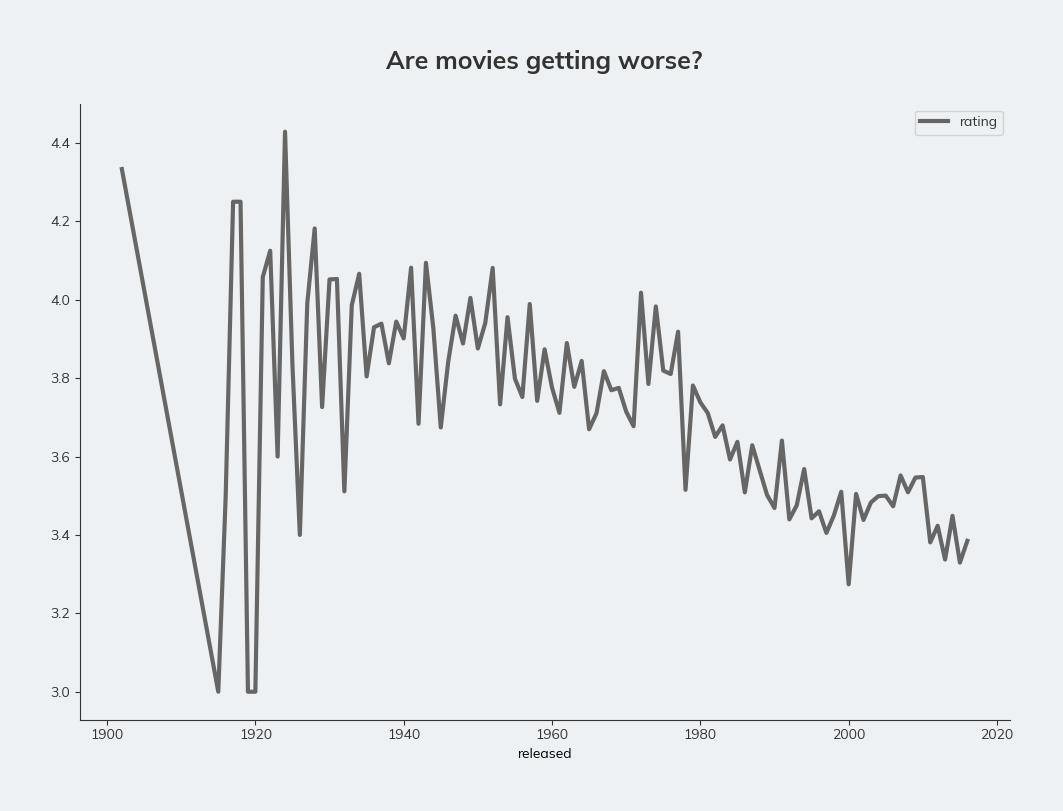
Smoothing the data
It certainly looks like it. The line is quite eratic. Let’s smooth out the data by using a rolling average using the rolling() method on the DataFrame. The minimum value on the y-axis is also 3.0, making the decline look more harsh. We can sort that by passing a ylim argument.
driver.execute_query(
    """
    MATCH (m:Movie)<-[r:RATED]-()
    RETURN date(m.released).year AS released, avg(r.rating) AS rating ORDER BY released ASC LIMIT 1000
    """,
    database_="neo4j",
    result_transformer_=Result.to_df
).rolling(window=10).mean().dropna().plot.line(x='released', y='rating', figsize=(12, 8), ylim=(0,5), title='Are movies getting worse?', c='red')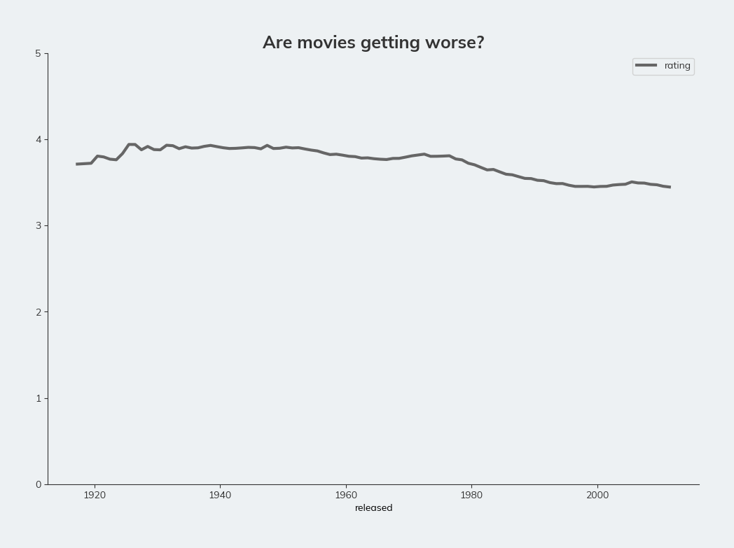
It certainly looks like there is a decline, although it is not as steep as it first appeared.
Still, it’s nice to quickly answer the question.